User documentation guidelines
An overview of how to create user-facing documentation for BaseKit V8
Types of document
We have three types of user docs:
- Tutorials - to show users all of the steps required to complete a task and explain the reasons behind those steps
- Reference - to share everything we know about a particular feature or widget
- Help - to get users 'unstuck' when they encounter common problems
Tutorials can become quite long and may need to be broken into several parts to keep the document length manageable. We will sometimes make tutorials as videos but we will still need the document for our partners who need something easily translatable.
Reference documents are the easiest kind to write but may be the least useful for a user. Most users don't want to know everything about a widget, they just want to know the one thing that will solve their problem.
Document management
We are using a tool called Readme (www.readme.io) to manage the creation and publishing of all V8 user documentation. In the past, we've used Zendesk and all V6 / V7 docs will remain on Zendesk.
We have two 'Projects' on Readme.io:
- resources.basekit.com - for all partner facing documentation
- sitebuilder.readme.io - for all user facing documentation
We're using Readme because it makes updating documents very easy and can be used by anyone inside or outside of BaseKit.
Readme uses a variation of Markdown for text formatting.
With Markdown, you use simple keystrokes to indicate formatting for a webpage instead of typing it as HTML.
Examples:
- # The largest heading
- ## The second largest heading
- You can make a list by preceding one or more lines of text with - or *.
- ** bold text ** will be rendered as bold text
You'll need to take a few minutes to learn about Markdown before using Readme.
Readme also supports the use of icons (from Font Awesome) and emoji.
Limitations of readme.io
The main limitation of Readme is that it has only level of categorisation so we can't created nested structures like English / Sitebuilder / Getting started. We need to support many languages but readme project cost about $60/month so we can't afford to have one for each language. Readme claim they will fix this in a future release but for now the only way to create a categorised list of docs is to create a 'custom' page i.e. a page that has links to all our docs arranged in some sensible way. Here's an example page.
Language
Our English documentation will be often be used by people who do not speak English as a first language.
To aid comprehension, we should try to avoid:
- Figures of speech
- "Shoot an email over to our support team"
- Contractions
- "don't", "hasn't"
- Abbreviations
- "TDK"
- Internal language
- "Desktop", "Package"
There maybe exception cases for any of these but unless you're certain you have an exception case you should avoid them.
Tips for creating screenshots
- Capture at a consistent window size (say 1280 x 900). To set this easily, use a Chrome plugin like resolution test
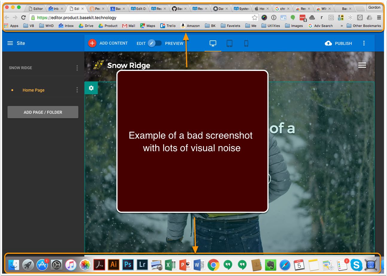
- Hide your browsers bookmarks bar (Shift-CMD-B) and any visible plugin icons
- Learn the keyboard shortcuts for capturing windows and parts of windows (https://support.apple.com/en-gb/HT201361)
- To save your screenshot to the Clipboard instead of a file on your desktop, use Command-Shift-Control-4.

Creating a bad screenshot
Using animations
Animations are a really good way to show the user how to interact with a piece of UI, as well as showing what the reactions might be from using it. Here are a few tips:
- Use LICEcap or Git Brewery to record animations, others are available
- Make sure to crop in with animations as the cursor is hard to recognise
- Try and keep under the size of 960px square, either by cropping the image or by scaling down your browser to show only the interaction mentioned
- Use 24 frames per second as a default, but if the file size goes beyond what's recommend try a lower number
- Crop browser and toolbars out if you can, this will keep the file size down and will less likely confuse the user
- Make sure the gif is no larger than 950kb
- If you need it to be larger, consider the graphics that are on the same page. Do they collectively balance out?
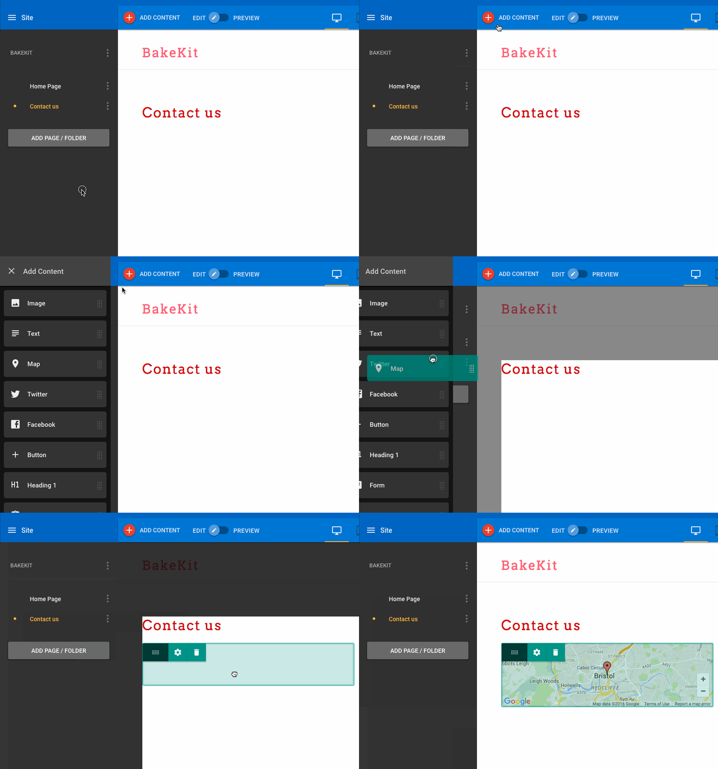
Take a look at the example below, note that the image has been deliberately scaled up. This is for visibility, we don't need to consider quality that much as gif images have a limited colour gamut anyway.

Example gif
Create an example site
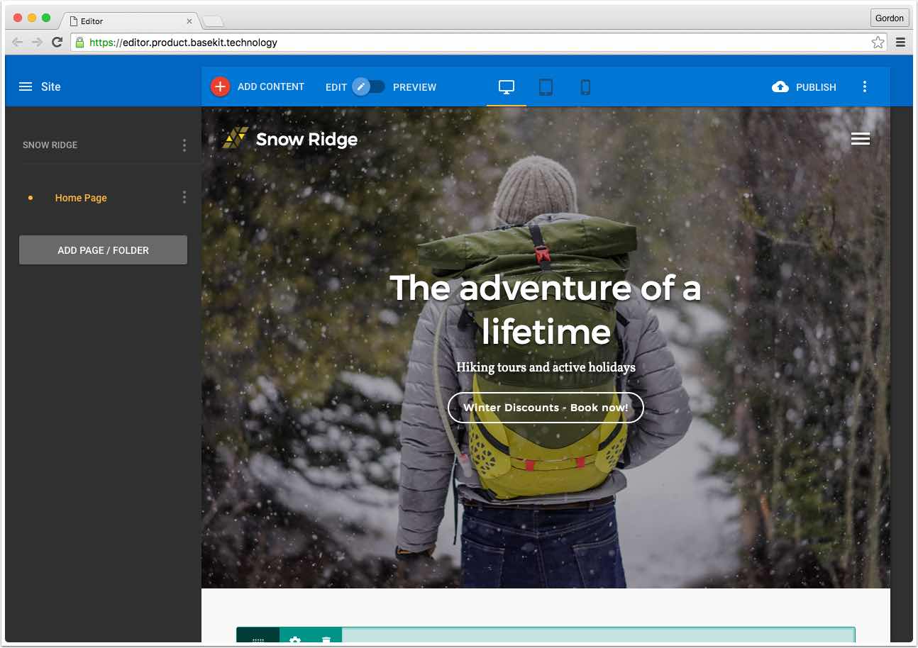
It's a good idea to create a site especially for use in creating help docs. For a business name, you can use 'Beekay' and create variations like Beekay Bikes, Beekay Holidays etc.
Make sure that:
- Any images you use are free of copyright restrictions (use unsplash.com or similar)
- The words 'BaseKit' is never visible (some partners won't use documents that refer to our brand)
- Any text content is spell checked

An example of an 'example site'
Giving instructions
We often need to give the user clear instructions on how to carry out a sequence of events. Usually, this will mean we create an annotated screenshot and an ordered ("numbered") list of actions that match the annotations.
For instructions, it's usually best to lead with verb ('click','move','enter'):
- Click Add Page / Folder
- Click the Folder Tab
- Enter a name for your folder
- Click Save
Formatting the UI label in bold is optional but can make the list easier to read
Use unordered lists ("bullet points") for listing examples where there is no particular order.
Text callouts in Readme.io
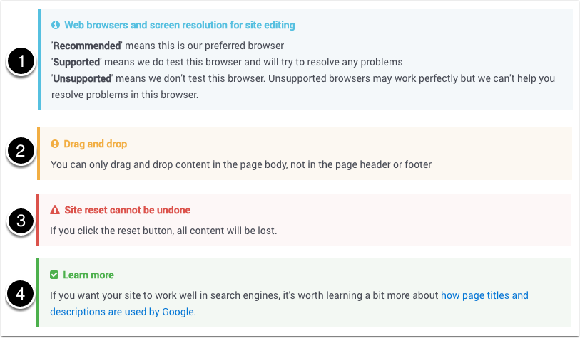
Readme supports four kinds of text callout:
- Info - additional information that the user might find valuable
- Warning - information about limitations or minor potential problems
- Danger - an action that will result in major loss of work or other serious consequences
- Success - confirm the completion of a sequence of events and suggest possible next steps

Callouts in Readme
Tools for annotating screenshots
You can use any tool you are familiar with for annotating screenshots. If you're not familiar with graphic design tools, you can use Preview, the Mac application that's part of OS X (ask Gordon for a lesson on this). We don't need a high level of visual consistency across documents as long the annotations are always clear.
Updated less than a minute ago
